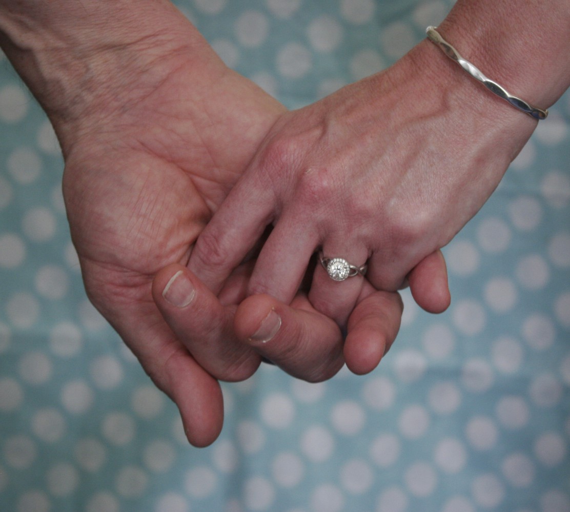


Every so often fiancé Steve offers his take on mid-life marriage. Here, his thoughts on why it’s good to have some differences.
In a previous post Sandee joked that for nerds like us, drawing a Venn diagram on a whiteboard at the wedding might make a better unity ceremony than mixing sand or lighting candles. The overlapping circles motif shows up on a number of patterns for wedding invitations or save-the-date cards, where I’m sure it’s intended to portray wedding bands overlapping.
 But a Venn diagram is not a bad way to look at what happens when “two become one.” A “Venn Diagram” shows the relationship between two sets, A and B. The area of overlap represents the things that A and B have in common, or the intersection of A and B. The total colored area is the union of A and B, or all things encompassed by either A or B.
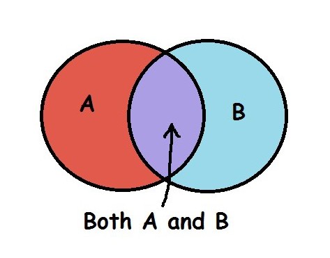 I imagine most couples spend some time pondering the things they have in common and the things that make them different. I’m curious about how much overlap works the best. If your circle barely touches your partner’s circle, you have almost nothing in common. That has to make communication difficult and suggests there are not many things you would enjoy doing together. Why be a couple, then? On the other hand, if you overlap too much, it means your partner is only slightly different from you, and perhaps doesn’t bring much to your life that wasn’t already there. I think most healthy couples’ relationships fall somewhere in between. Continue reading
